
User style: 1973 prism, the Dark Side of Stylus

After the previous dark theme for Stylus was published, I was left feeling a little unsatisfied with the result. I thought I could do better, but didn't have the inspiration. That inspiration came to me as I listened to the 1973 album Dark Side of the Moon by Pink Floyd, while checking out how to use PrismJS to display code on Blogger. It suddenly hit me: 1973 prism, the Dark Side of Stylus was born...

Logo: 1973 prism, the Dark Side of Stylus

Features

This new Stylus theme is dark, but more elegant than the previous theme for Stylus that I did, and shows colourful accents in both the edit style page and the styles management page. It is also more complete in that settings, options, export and information screens have been darkened as well. So no more sudden painful experiences for your eyes when opening a bright submenu or a popup screen in the middle of the night!
The theme displays a clear visual identifier on top of a code block to indicate that code has been modified.

Screenshot: 1973 prism, the Dark Side of Stylus: edit pag

1973 prism, the Dark Side of Stylus: edit page

Furthermore, it introduces my first theme for the code editor (CodeMirror), which is based on the okaidia theme for PrismJS by @ocodia, which in turn was loosely based on the Monokai textmate theme by @monokai.

...hear the softly spoken magic spell...

To activate the 1973 prism theme for CodeMirror, just select the Default theme in the Stylus settings. You may have to press F5 to refresh once or twice if the editor still shows black on white after activating the default theme.

Screenshot: 1973 prism, the Dark Side of Stylus: styles management page

1973 prism, the Dark Side of Stylus: styles management page

Screenshot: 1973 prism, the Dark Side of Stylus: export style

1973 prism, the Dark Side of Stylus: export style

Screenshot: 1973 prism, the Dark Side of Stylus: the Stylus quick edit menu

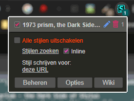
1973 prism, the Dark Side of Stylus: the Stylus quick settings menu

Now warm your bones beside the fire and enjoy the Dark Side of Stylus!


User style: 1973 prism, the Dark Side of Stylus:

Popular posts from this blog

It's here, it's great and it's Not Over Yet!

A funky organ, a funky brass section, a steaming rhythm section, easily the best guitar player this part of the western hemisphere (okay, not counting Jan Akkerman) and the most soulful smokey singer you have ever heard. All of that and gorgeously crafted songs, a lot of soul and passion. That's the new album Not Over Yet by fusion veterans Back to Basic. It was released yesterday, June 25th. For me this is no doubt the best album Back to Basic has ever released. And that's saying a lot. I suggest you install Equalizer APO , plug in your earphones and have a listen: The album is available on many music platforms, including YouTube (see above) and Spotify and can be purchased via Amazon , among others. For me this is no doubt the best album Back to Basic has ever released. And that's saying a lot. Review Honestly, what's not to like? Admittedly, to some young folks out there the band's members may look like old rockers. And I guess they are that too...

Listen to Jumbo from Monterrey, Mexico

I'm sure you recognize the joy of discovering fantastic music that you've never heard before. At least I hope you do! And if not, you will... let me explain. There's a fair chance you have heard of Jumbo: there's Jumbo as in the elephant, Jumbo as in the chain of grocery shops, Jumbo the famous games creator, it's a single by the Dizzy Man's Band, it's even the name of a guitar shape. ...language is irrelevant... I bet you didn't know though that Jumbo is also the name of an alternative rock band from Monterrey, Mexico that was founded in May of 1997. Why Jumbo the band never reached even the smallest form of fame outside of Latin America is beyond me. I just discovered them today, when all I wanted to do was to see if Jumbo the supermarket sells a certain beer brand that was recommended to me by a friend. True story. The result in the side bar that Qwant (my default search engine) showed was a Wikipedia page, ' Jumbo (band) '. Never...

Food Colour Graph for Food Bloggers

In a side project I have been working on a WordPress website for a health and food blogger. There is a huge amount of food themes available for WordPress. Although this may seem like a big advantage, this large choice of themes also gives me stress. Another source of stress is me being picky about the choice of fonts and colours. Although I was given free reign, which I like, the responsibility to make the correct choices weighs heavily. Choosing colours How do you choose colours for a website? Often a client has a logo or house style, which makes the choice a little easier. Sometimes even there is no choice at all, but preconceived ideas and designs. Color circle by Ellywa at Dutch Wikipedia - downsized from 600 x 600 to 400 x 400 However, more often than not a client has not really given any serious thought to design elements. So, where to start when choosing colours? In this case I came up with the idea to work with colours linked to different food i...